
NARRATIVA
One idea,
many expressions.
Ideas that move brands.
Visual identity for a creative studio connecting brands, ideas and experiences.

A voice grows
from a name.

The identity challenge
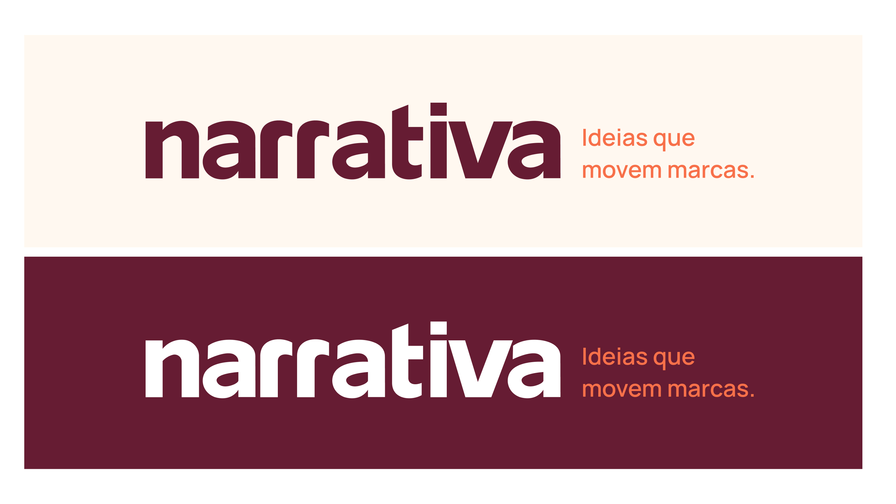
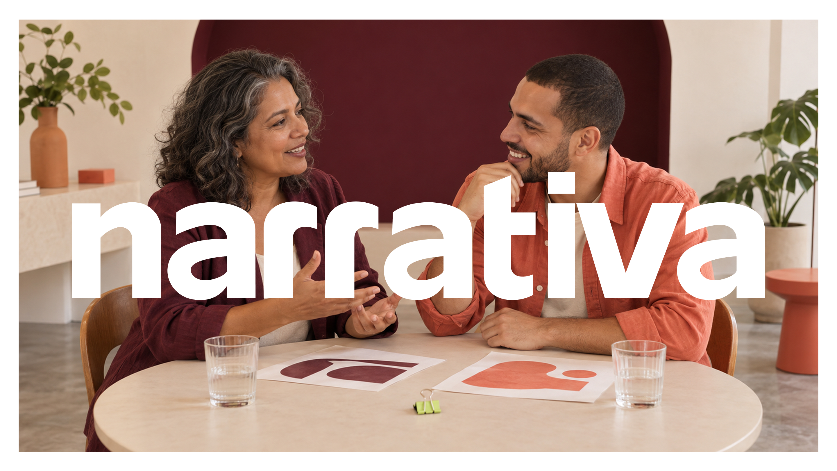
The identity begins with the name.
The initial solution was a wordmark-only identity, with character built into the letterforms.
The studio
One idea. Many touchpoints.
Narrativa creates campaigns that connect a brand’s presence across physical and digital spaces.

A challenge of scale.
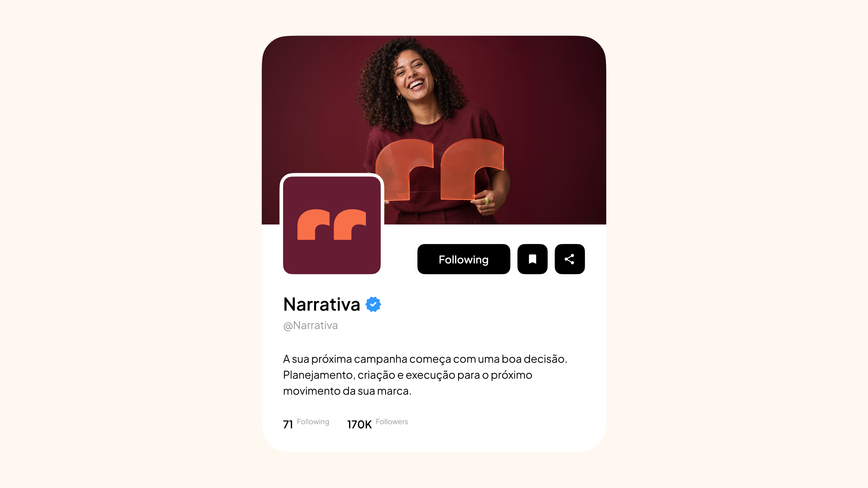
In favicons and avatars, reducing the full name compromises legibility. A compact expression was needed.


The solution was in the “rr”.
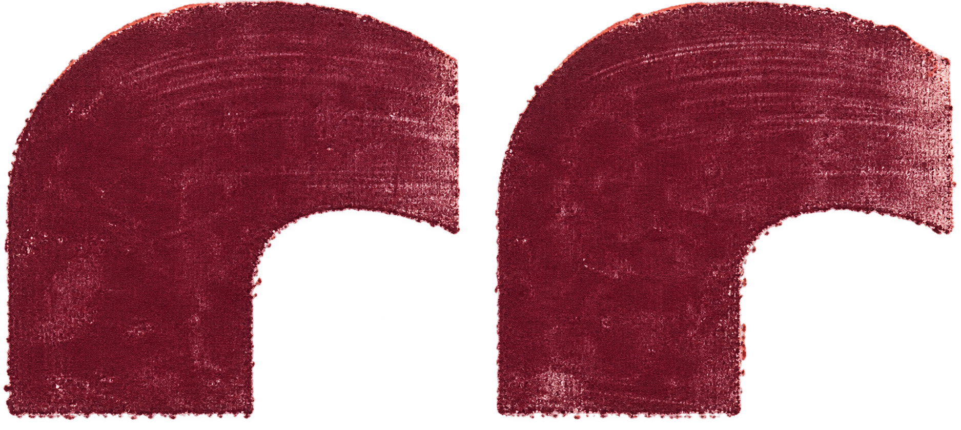
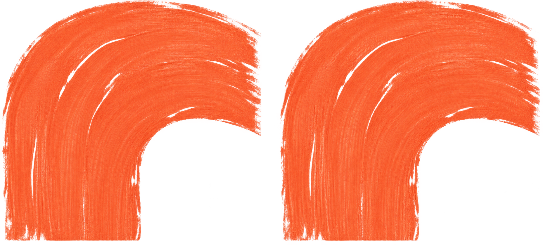
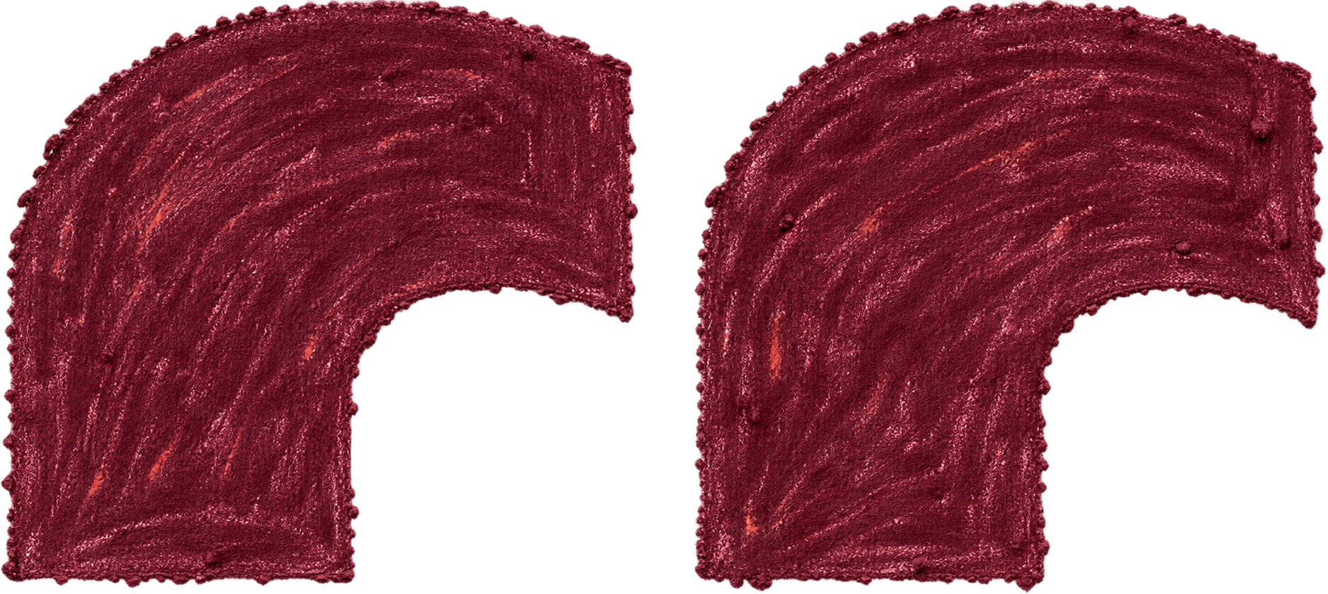
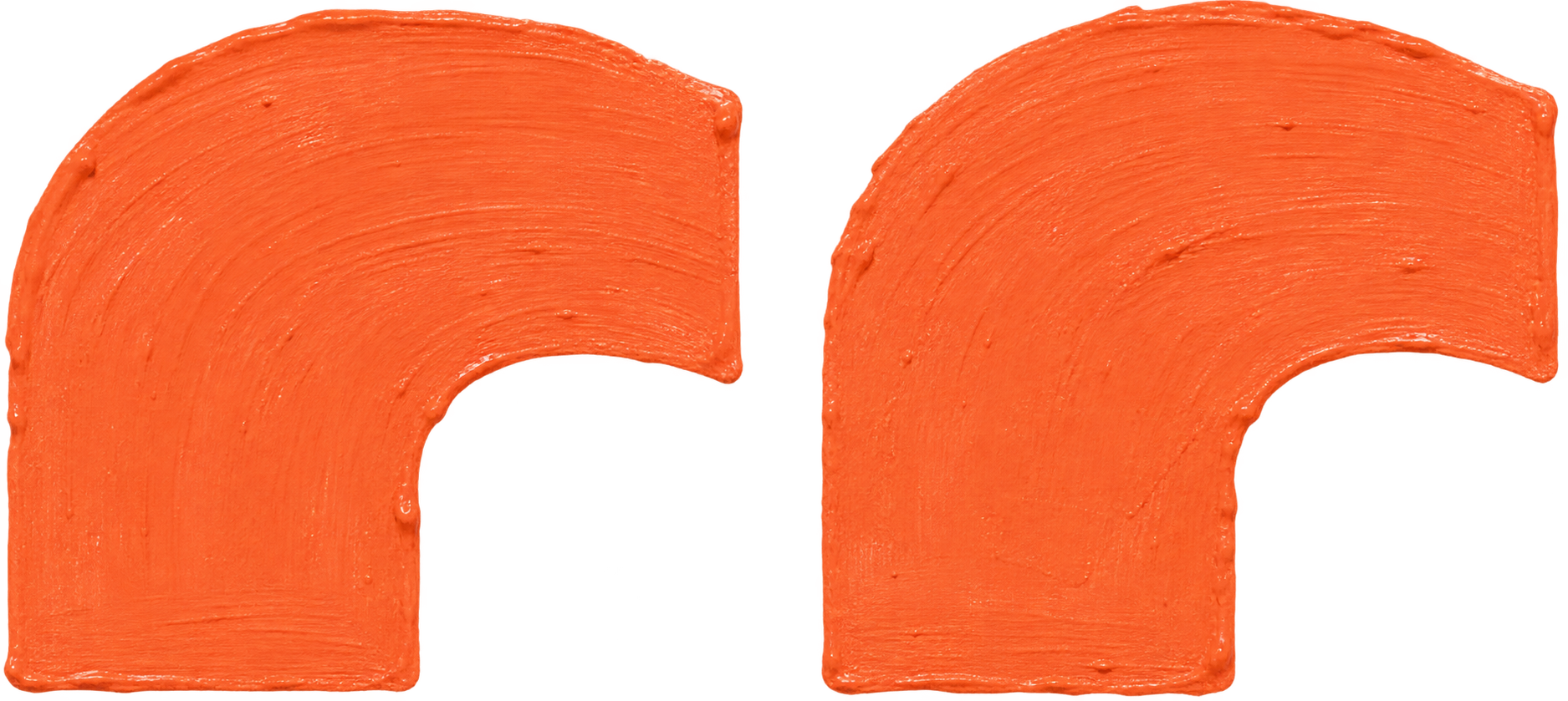
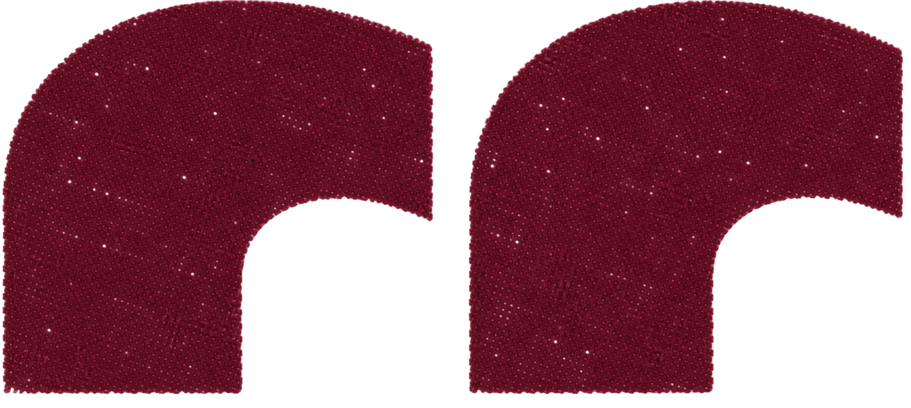
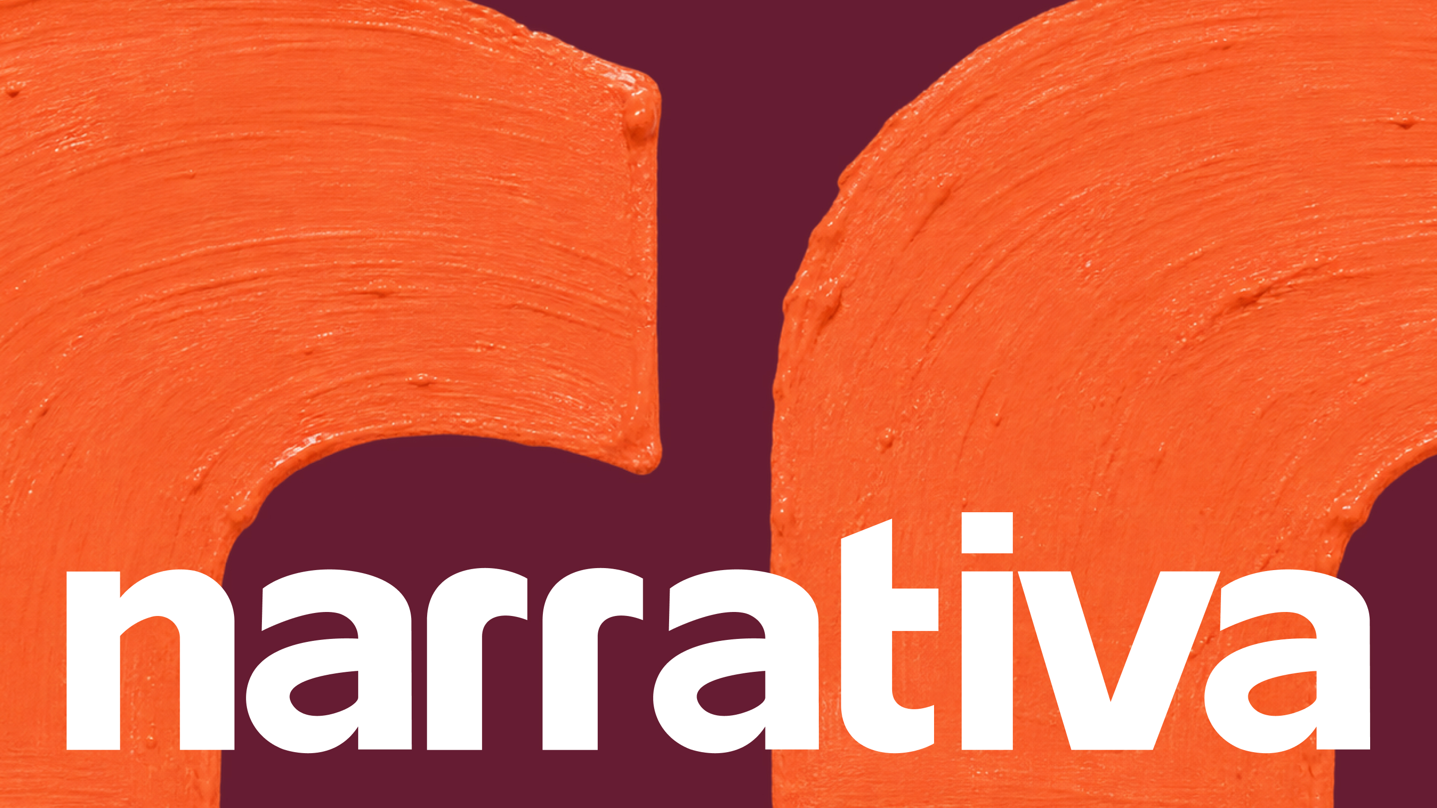
The upper portion of the two “r” letterforms reveals opening quotation marks: a compact symbol derived from the wordmark and connected to the name.
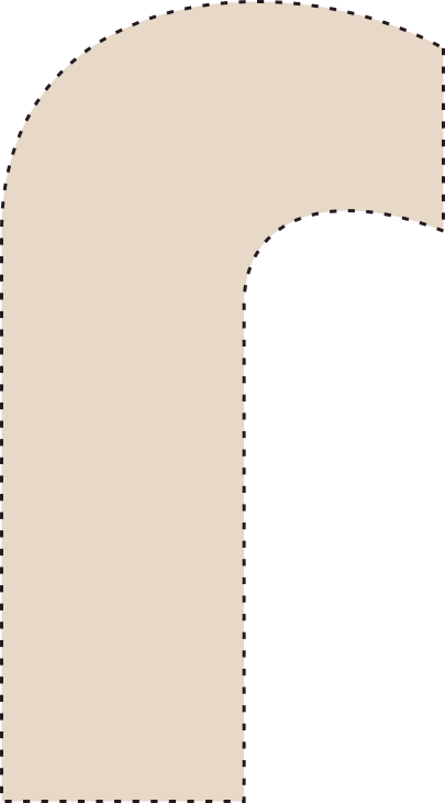



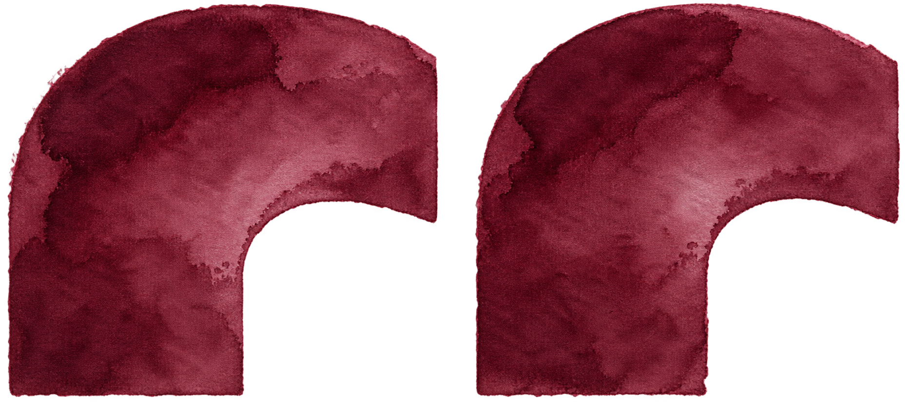
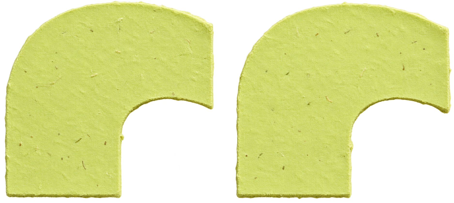
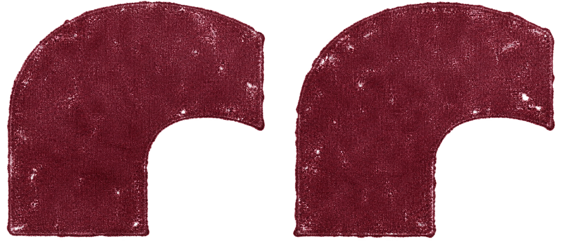
One form. Different materials.
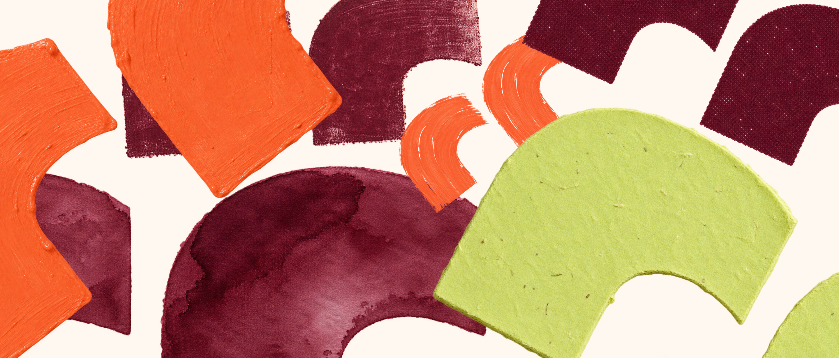
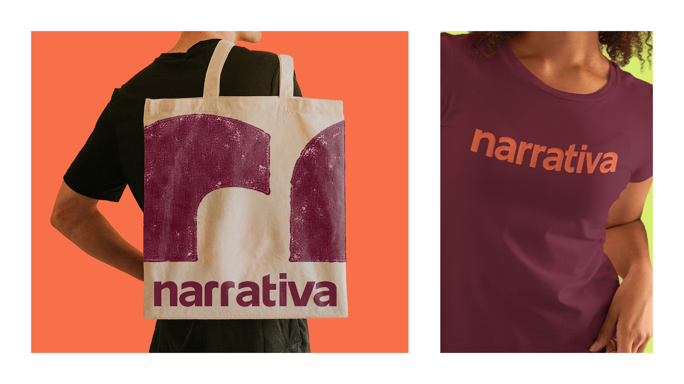
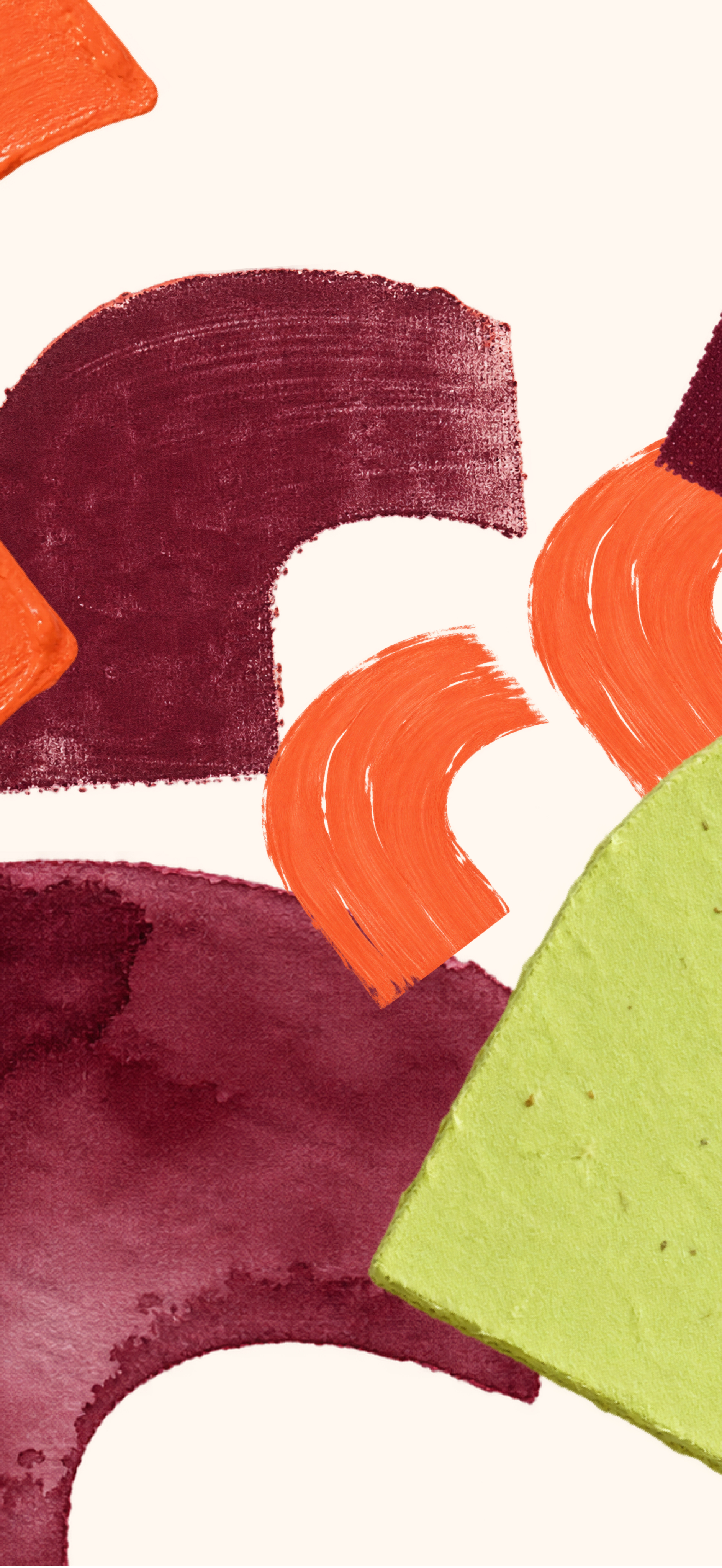
Paint, printing and paper transform the symbol’s expression while retaining its origin.
Color expands the expression.
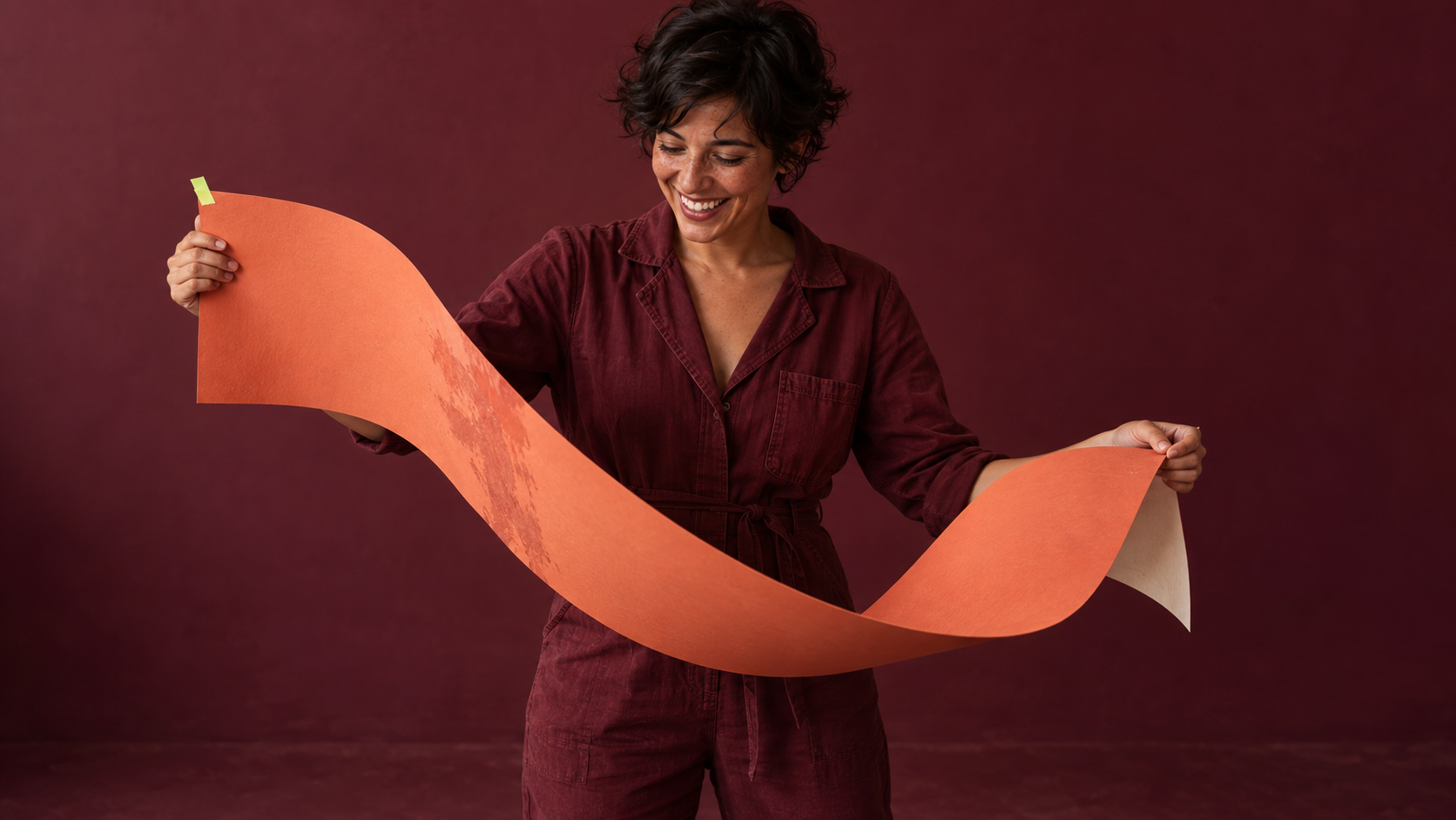
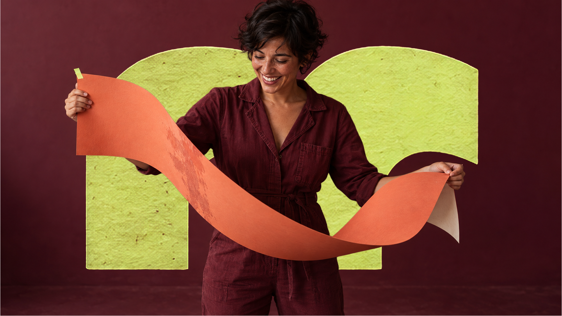
Burgundy anchors the identity. Coral, lime and pale pink expand the combinations, supported by neutrals.










narratype
From a name to a brand voice.
The wordmark’s personality needed to extend into the brand’s messages. Its letterforms became the starting point for a custom typeface, sharing curves, cuts and proportions, with Narrativa’s symbol as its quotation marks.
Narratype · type in use
“ideas that move brands.”
one idea, many expressions.
Alphabet
a b c d e f g h i j k l m n o p q r s t u v w x y z
Numerals, accents and punctuation
0123456789
á à â ã é ê í ó ô õ ú ü ç ñ
“narrativa” . ! ? , : ;